BIG20
Design and launch of a connected product for tabletop gamers
BIG20
Design and launch of a connected product for tabletop gamers
A digital dice roller for moments that beg for a bit more fanfare.
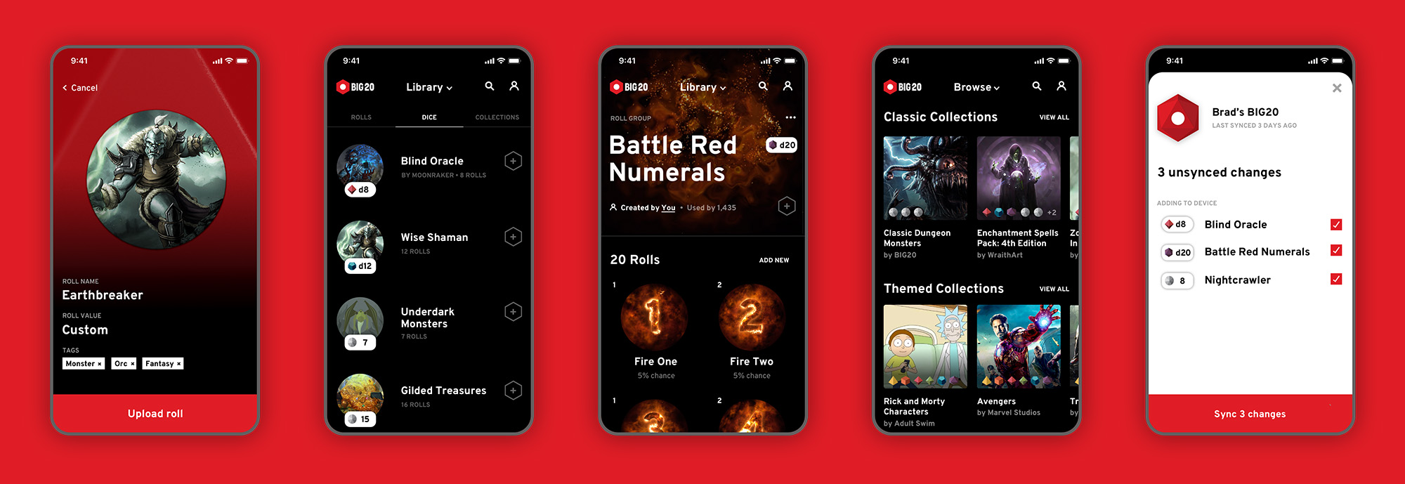
BIG20 was born out of a need to bring more excitement to the Dungeons & Dragons table. We wanted to give D&D nerds something tangible that reflected the unbridled creativity they put into their gameplay. We focused on the pivotal “roll” moment. BIG20 is a fully customizable dice roller that allows players to roll through numbers, monsters, items, what to eat for lunch – just about anything they can dream of.
I co-founded BIG20 alongside my friend and business partner, Brad Roan. We launched on Kickstarter in August 2018 to help gather early funding and test demand in the market. Despite some early excitement on social media platforms like Imgur and Reddit, the demand wasn’t big enough. We decided to move on to other ventures.
Client
Self (co-founder)
Method (Internal)
Date
2018
Role
Role
Co-founder, Creative Director
Type
Product Design
Feature On
Front page of Imgur
Front page of Reddit
Strategic Vision
Delivering branded content through unique devices
BIG20 marked a first step in our broader strategy targeted at niche markets like tabletop roleplay gamers. We saw an opportunity to disrupt traditional physical merchandising by delivering branded digital content to gaming experiences through connected devices. Imagine a Rick and Morty or Harry Potter theme taking over a group’s gameplay. We aimed to develop a variety of functional devices that can be themed through an extensive platform.
Creating Big20
Full customization through a mobile app
I designed preliminary flows for a mobile app to demonstrate the value of BIG20’s customizable nature. Part of the challenge was to create a simple and logical taxonomy of rolls, dice, and collections as a structure for organizing content.
Creating Big20
Developing early content for launch
I developed an early set of content for the device to help build hype and show value to potential customers. We used this content both for marketing through a social media campaign and to test the device in action.
Launch
Using Kickstarter to evaluate demand
Much of our time was spent preparing and launching BIG20 on Kickstarter. I provided art direction for a commissioned illustrator, Alex Chen, to build materials for a compelling story. We chose a visual style distinctively different than our core look and feel to separate the campaign from the product itself. We saw this crowdfunding campaign as a way to test market demand. Though disappointing, it was useful to know the downfalls early before taking it any further.
You can see the Kickstarter page here.
Aviation ClientProduct and Service Ecosystem
Connected FoodHardware Prototyping & Speculative Design
Future of FinanceStrategic Design
Logitech G HubProduct Design & User Validation
ScoutImmersive and Personalized Education
Surrounded by DataExploration of Future Interfaces & IoT
RoomieIoT Connected Room Sign